 Screenshot 2023-02-08 at 00-11-59 Home – Home Assistant.png
How do you make a plain round button on a Home Assistant dashboard?
With card_mod, it's very easy! Let's see how.

Home Assistant is the most popular open source project in the world — and for good reason. The prospect of a proper smart home, compatible with almost every smart device under the Sun, and free from proprietary lock-in, has been made real by Home Assistant.
Mushroom cards is an extremely popular dashboard add-on for Home Assistant. The most beautiful and practical dashboards made by Home Assistant users are almost always using Mushroom cards to arrange things marvelously.

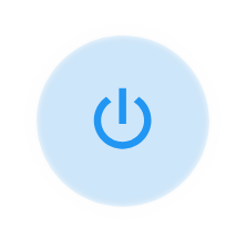
But sometimes you just want something simple. Like a power button that looks nice, to toggle a device at home. You just want a plain round button. Suppose you have this:

But sometimes you just want something simple. Like a power button that looks nice, to toggle a device at home. You just want a plain round button. 
See that? It's just a button — no more. It's round, doesn't have any labels, border, or background. It is a Mushroom entity card — it's just been styled to kick ass.
How is that round button done?
card_mod styling to the rescue!
card_mod is a dashboard add-on for Home Assistant that lets you style dashboard elements in almost arbitrary ways, using CSS (Cascading Style Sheets) directives.
I'll show you the YAML that produces the row above, and then I'll explain:
card:
  type: grid
  square: false
  columns: 2
  cards:
    - type: custom:mod-card
      style:
        hui-grid-card$: |
          div#root {
            display: grid;
            grid-template-columns: min-content max-content;
          }
        hui-grid-card$ mushroom-entity-card$: |
          ha-card {
            border: unset;
            background: unset;
          }
      card:
        type: grid
        square: false
        columns: 2
        cards:
          - type: custom:mushroom-entity-card
            entity: switch.media_center
            primary_info: none
            secondary_info: none
            icon: mdi:power
            tap_action:
              action: toggle
    - type: grid
      square: false
      columns: 2
      cards:
        - type: custom:mushroom-entity-card
          entity: switch.marantz_av7702mkii_subwoofer_adjust
          name: Sub
          secondary_info: none
          tap_action: null
        - action: toggle
          type: custom:mushroom-entity-card
          entity: switch.marantz_av7702mkii_dialog_adjust
          name: Dialog
          secondary_info: none
          tap_action:
            action: toggle
I've bolded the two blocks that make the magic happen. Let's go over them to see what's up:
- The first block creates a
mod-card, which inside of it (as you can read) nests agridcard. Mod cards let you style what's in them, when they are not cards (which is the case for the grid element). Within the style group, you have two entries:hui-grid-card$styles the containerdiv#rootof the Mushroom entity card that makes up the button. This style does not make the button round, but it does make the button a "minimum size". By default, Mushroom cards want to grow to fill the space to their left and right, and we don't want this here. This style makes it so that — our button being contained within a two-column grid — the second column of the grid (blank) takes the remaining space, "flattening" the button towards the left.hui-grid-card$ mushroom-entity-card$then applies the "buttonification" style to the actual button card (ha-card). No border, no background; presto!
- The second bolded block simply tells the Mushroom entity card to show no text at all — just the icon per favore. Since the icon happens to be round, you have the effect you want!
The italicized block is not necessary and is simply there to create the other two buttons, titled Sub and Dialog respectively. In my setup, these buttons govern my receiver's subwoofer boost (great for poker nights) and the dialog boost (great for late movie nights).
Extra tip! If you want to make the button 100% round while keeping the Mushroom card's background and outer border, you can! Instead of using border: unset; and background: unset; (in the style block targeting the entity card), just use border-radius: 48px;. It looks great with non-rounded icons too!
 Screenshot 2023-02-08 at 00-11-59 Home – Home Assistant.png
 Screenshot_20230208_001245.png
 Screenshot_20230208-013120.png

