 image.png
How to add CSS styles and classes to a Home Assistant Markdown card
Turns out it's not that simple — but there's always a way.

Home Assistant ships with an impressive set of cards you can add to your dashboards. One of these cards is the Markdown card — it lets you construct basically arbitrary layouts of text, pictures and icons directly using Jinja templating. You can even use HTML directly, and that works fine.
The inflexibility problem with the card arises when one tries to add CSS styles to the HTML in the template contents. Styles depend on using the attributes class= and style= in each HTML tag. The renderer for the Markdown card strips these attributes altogether, making it impossible to add custom CSS.
There is a way forward, though!
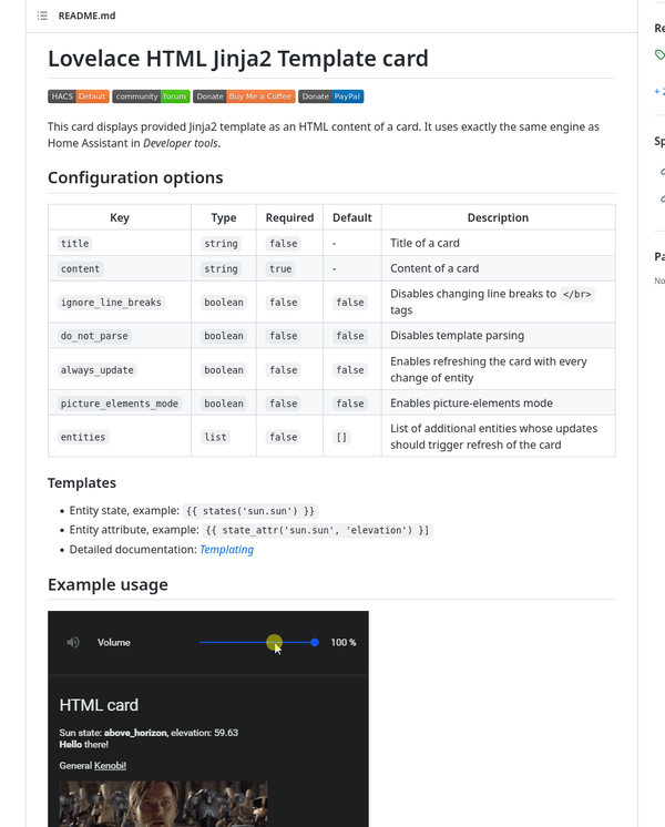
Enter Piotr Machowski's Lovelace HTML Jinja2 Template card.

This is a custom card you can add to your Home Assistant's list of cards (using HACS).
Once added, you can simply add the card to your dashboard, and type in the HTML — and, yes, Jinja templating code! — as per the instructions in the page linked above.
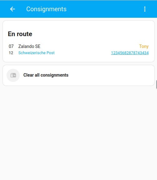
For example, look at this card code, which uses custom attributes from a sensor of mine. Use the tabs to flick between the code and the card.
Code for the card
type: custom:html-template-card
ignore_line_breaks: true
entities:
  - sensor.mail_consignments
content: >
  {%- for key, values in state_attr("sensor.mail_consignments",
  "by_status").items() -%}
  {%-   if key not in "collected" and values -%}
  <h2>{{     key.capitalize() }}</h2>
  <table style="width: 100%">
  {%-     for value in values -%}
  <tr style="display: grid; grid-template-columns: min-content auto;">
  <td    style="display: grid; grid-template-columns: 1fr; padding-right:
  1em;"><span>{{ value.arrival_date.split("T")[0].split("-")[2] }}</span><span
  style="font-size: 90%;">{{ value.arrival_date.split("T")[0].split("-")[1]
  }}</span></td>
  <td   class="consignment-content">
  <div    style="display: grid; grid-template-columns: auto auto;">
  <div      class="consignment-sender">{{ value.sender }}</div>
  <div      class="consignment-recipient" style="text-align: right; color:
  var(--accent-color);">{%- if value.recipient|default(None) -%}{{
  value.recipient.capitalize() }}{%- endif -%}</div>
  </div   >
  <div    style="display: grid; grid-template-columns: 1fr 1fr; color:
  var(--primary-color); font-size: 90%;">
  <div      class="consignment-transporter">{{ value.transporter }}</div>
  <div      class="consignment-code" style="text-align: right">{% if
  value.tracking_link|default(None) %}<a style="color: var(--primary-color);"
  href="{{ value.tracking_link }}">{% endif %}{{ value.parcel_code }}{% if
  value.tracking_link|default(None) %}</a>{% endif %}</div>
  </div   >
  </td  >
  </tr>
  {%-     endfor -%}
  </table>
  {%-   endif -%}
  {%- endfor -%}
How the card looks like

If you need to build custom interface elements that respond to entities' ever-changing states, this card is highly recommended!
A final note: this card is not compatible with card-mod by Thomas Lovén. That said, not a big issue — if you're going to style your UI elements, as we can assume because you're using this card, you can always do it directly in the elements.
 image.png
 Screenshot_20221207_014635.jpg

